ROCKY CROC. Bright packaging design and star character development
Rocky Croc is a new line of refreshing hard lemonades with bright fruit and berry flavors from JSC “Lidskoe Beer”.Super tasks for this hot summer:
- to create a bold and memorable Rocky Croc image.
- To develop a bright, unique packaging design for the trendy youth product.
Agency solution:
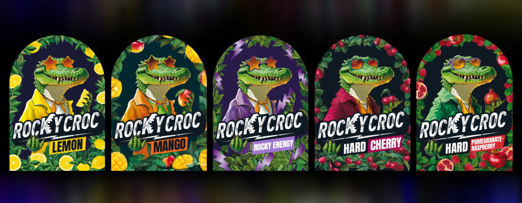
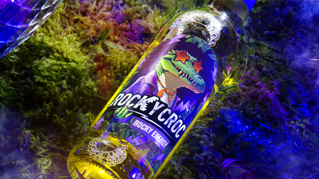
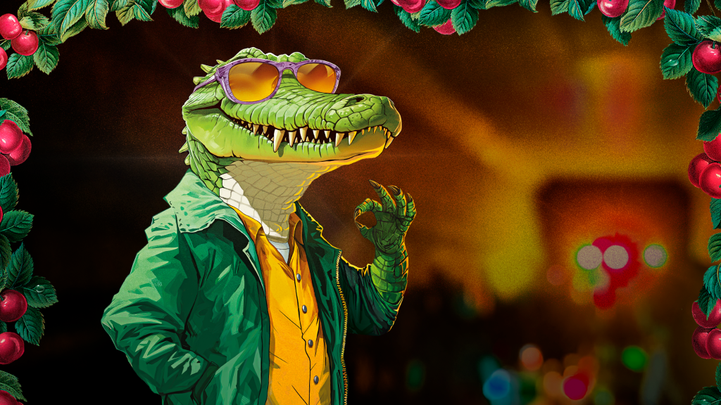
Created the character of ROCKY CROC — a fashionable crocodile symbolizing boldness and style. A crocodile that is ready to give out vibes of youth and inner freedom.
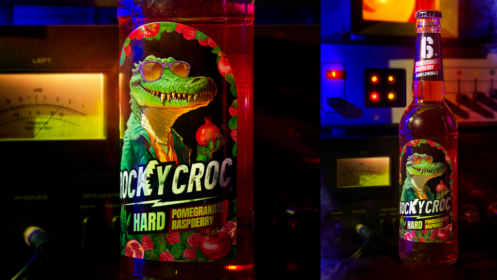
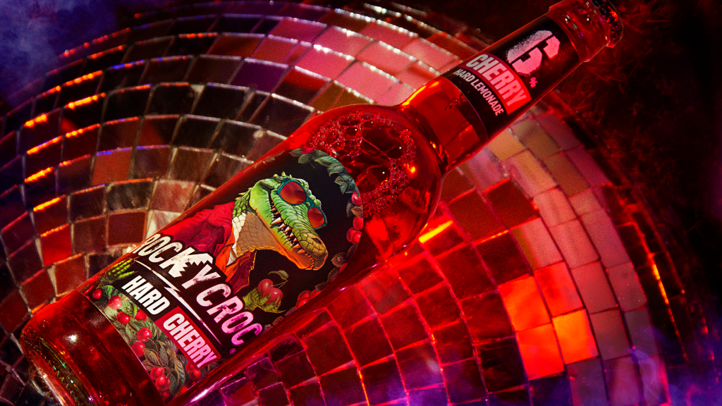
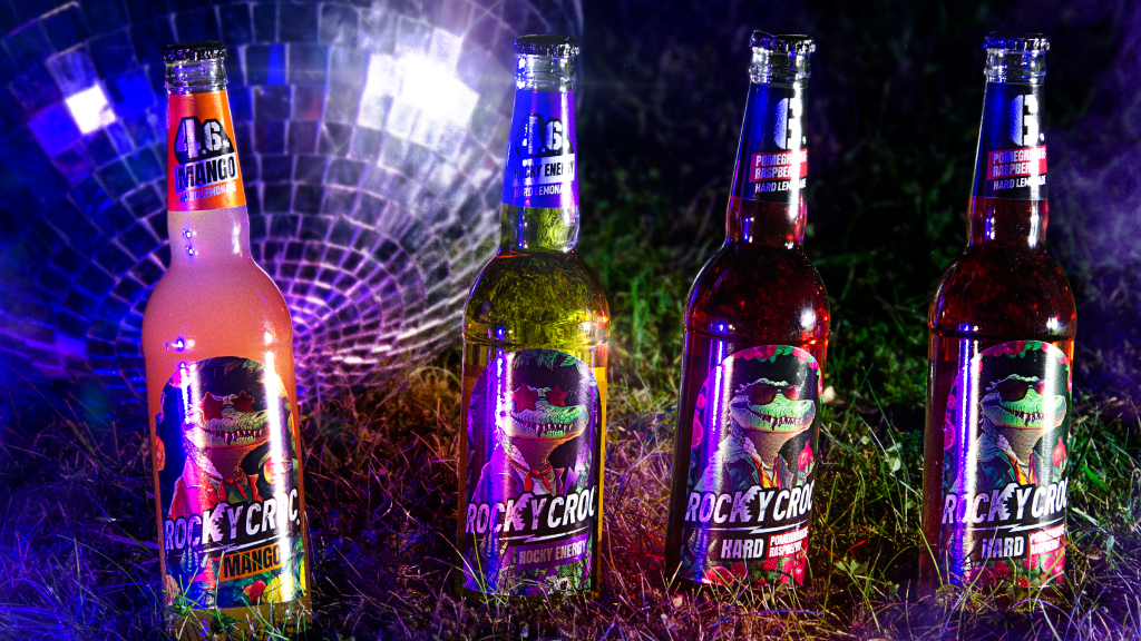
The character is the central and most active element of the label and is framed by vegetable frames of fruits and berries adding significance to the main character and indicating the taste of the drink. In its paws the crocodile holds the logo and the attribute corresponding to a particular flavor.
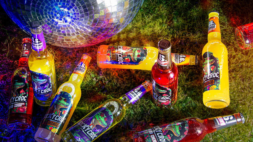
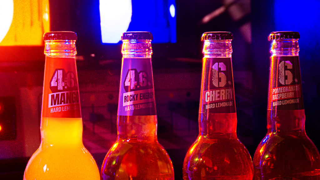
The hard lemonade lineup currently has 5 flavors and two strength levels: 4.6% (mango, energy, lemon) and 6% (cherry and pomegranate-raspberry). For differentiation within the lineup by strength level, the alcohol percentage is printed on the necklace. The necklace of the 6% drinks sub-line is made in a dark color. The design was developed taking into account the anticipated expansion of the brand's portfolio.
So, Rocky is cool.
Meet!
Love!
Praise!
Project team:
Ilya Pushkar — Art director
Irina Shebeko — Technical director
Julia Kostyukevich — Designer
Veronika Nesteruk — Designer
Olga Oleinik — Managing Partner, Creative Director
Natalia Yelinskaya — Account director

