Growth strategy in a dynamic diagonal: AVC has created a new identity for the company “A-100 Development”
Background
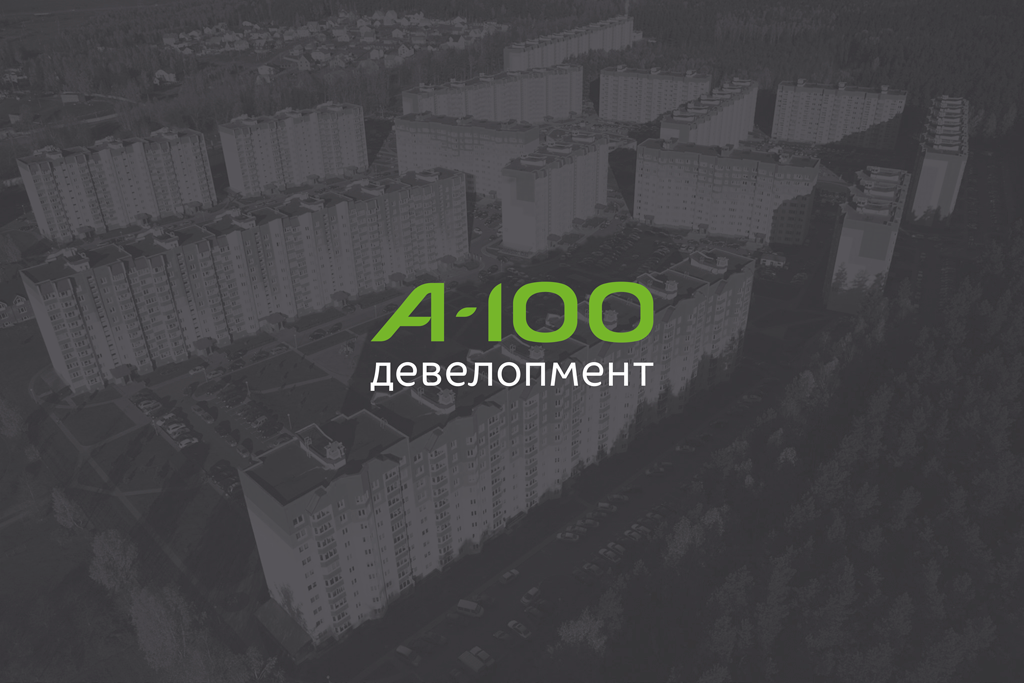
“A-100 Development” is one of the key business units of the “A-100” group of companies. The scope of the organization includes a full range of works on the creation and operation of real estate. Growing construction volumes, unquestioning fulfillment of all obligations and high social responsibility have made A-100 Development one of the largest and most reliable developers on the Belarusian market.
Task
The company turned to the AVC branding agency to create a new brand visual strategy that was supposed to:
— correspond to the updated company positioning, reflect its values;
— be relevant to all areas of work of “A-100 Development”;
— distinguish the style of "A-100 Development" from the style of the petrol stations chain "A-100", eliminate confusion between brands.

Solution
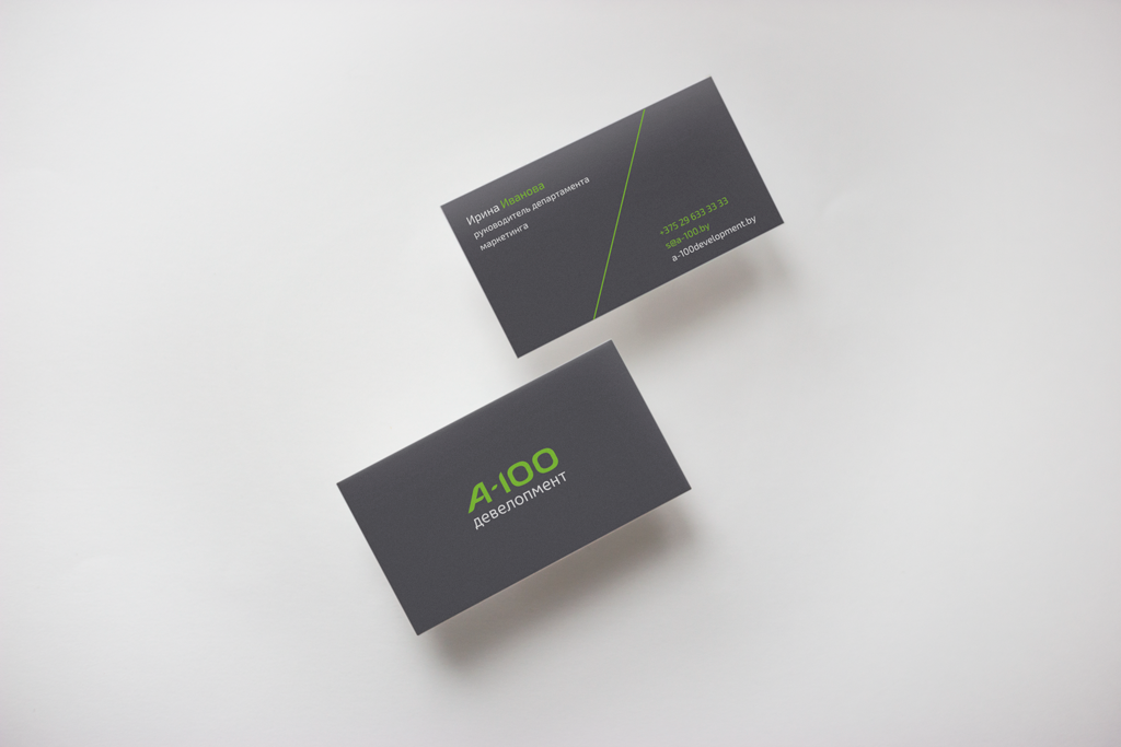
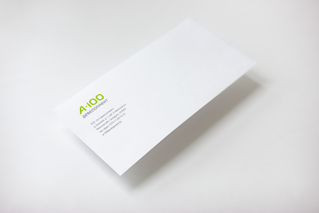
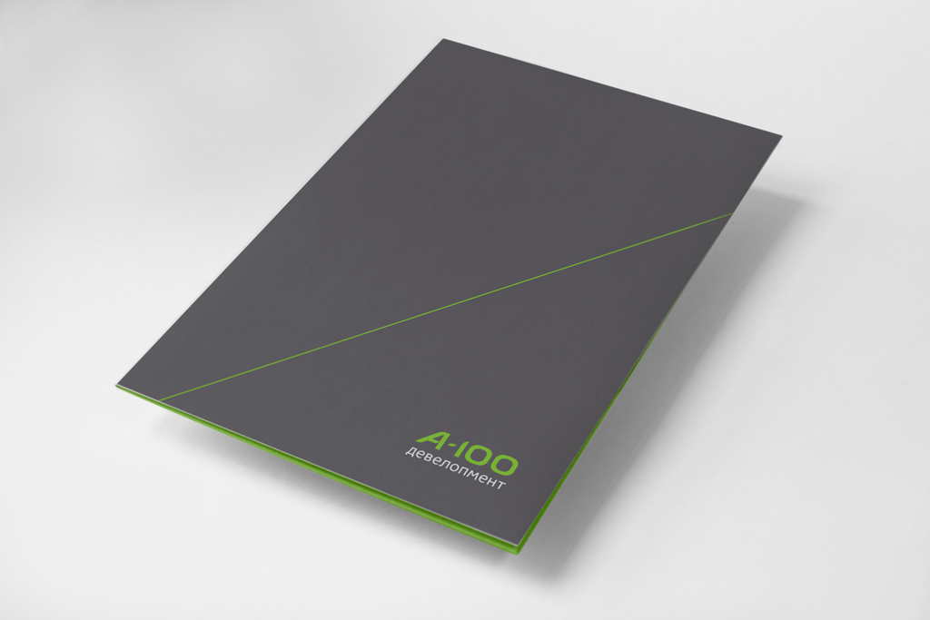
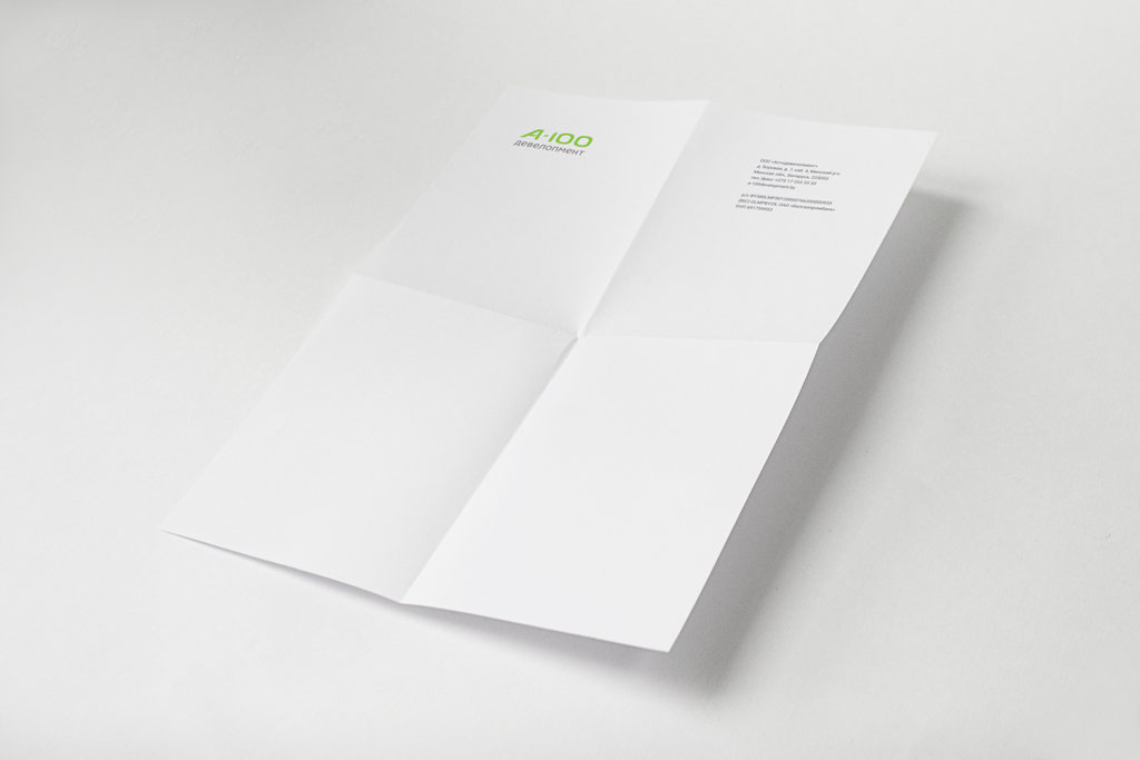
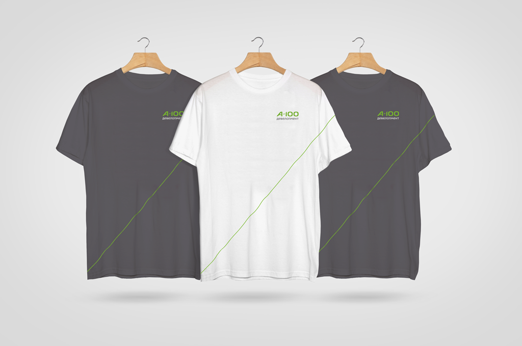
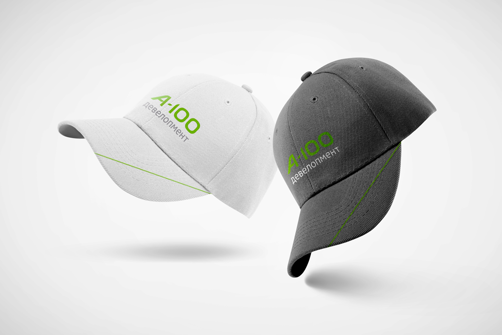
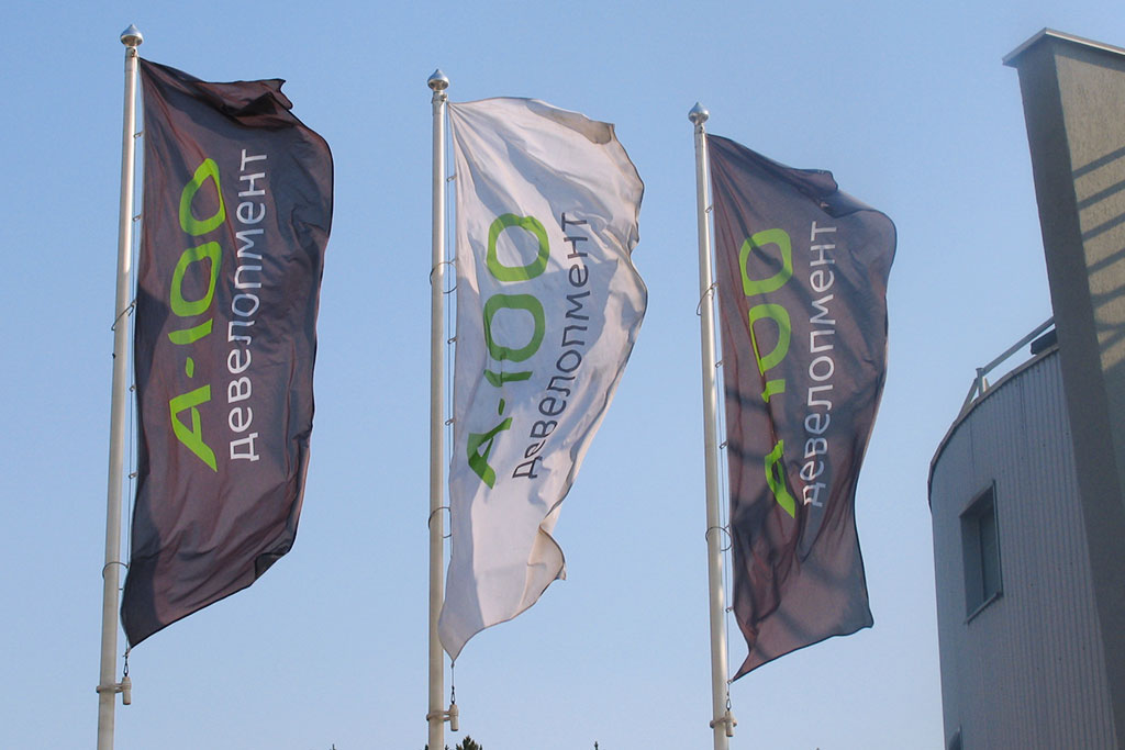
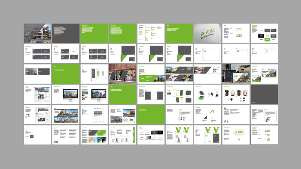
The main element of the visual brand identity is the logo. The diagonal of the inclined element of the letter A symbolizes the growth strategy. Additional brand elements - “dynamic diagonals” - develop and support this idea. An accurate balance of plasticity and clarity in typography translates openness and at the same time expertness.
